
An illustrated history of Interactive books Part 8: The reaction on the Sabuda/Reinhart Extravaganza; Minimalism (French School) in pop up, by The Booknook Librarian (21st century)
Contemporary voices and types: Fergusson, Bataille and Boisrobert/Rigaud and minimalism (the French School)
As the field diversified in the 21st century, many new voices brought their own sensibilities—and preferred types of mechanisms—to interactive and pop‑up books. Richard Fergusson (often credited in design and pop‑up circles) represents the strand of pop‑up work that leans into design thinking and educational or conceptual projects. His contributions highlight the use of precise folding and structural logic to explore themes like architecture, mathematics or engineering itself. In such work, the pop‑up is not just illustration but also demonstration: each unfolding shows a principle about space, balance or transformation, often using pure fold geometry with minimal imagery.
I’ve shown 2 examples of his work in the episode 6: The Nutcracker and The Snow Queen:
Marion Bataille
ABC3D
ABC3D“, by Marion Bataille, was published in 2008 by Éditions du Seuil (French original) and Tate Publishing/Roaring Brook Press (international, ISBN 9781596434257, hardcover, 38 pages, 19x14x5 cm thick).
It’s another example of minimalism showing off sheer inventiveness being key above mechanical complexity to show “pop up” letters of the alphabet. E.g. a letter “V” popping up is simply turned into a “W” using a mirror. Simple but brilliant!
Each spread transforms letters A-Z through ingenious mechanics in a typographic playground celebrating the alphabet’s kinetic potential without narrative, pure visual delight for all ages.
Its minimalist value defines pop-up modernism: stark black/red/white palette, no text beyond letters, and economy of motion where each device spotlights one transformation, proving profound engagement from elemental paper play unmarred by excess.
EXAMPLE from:
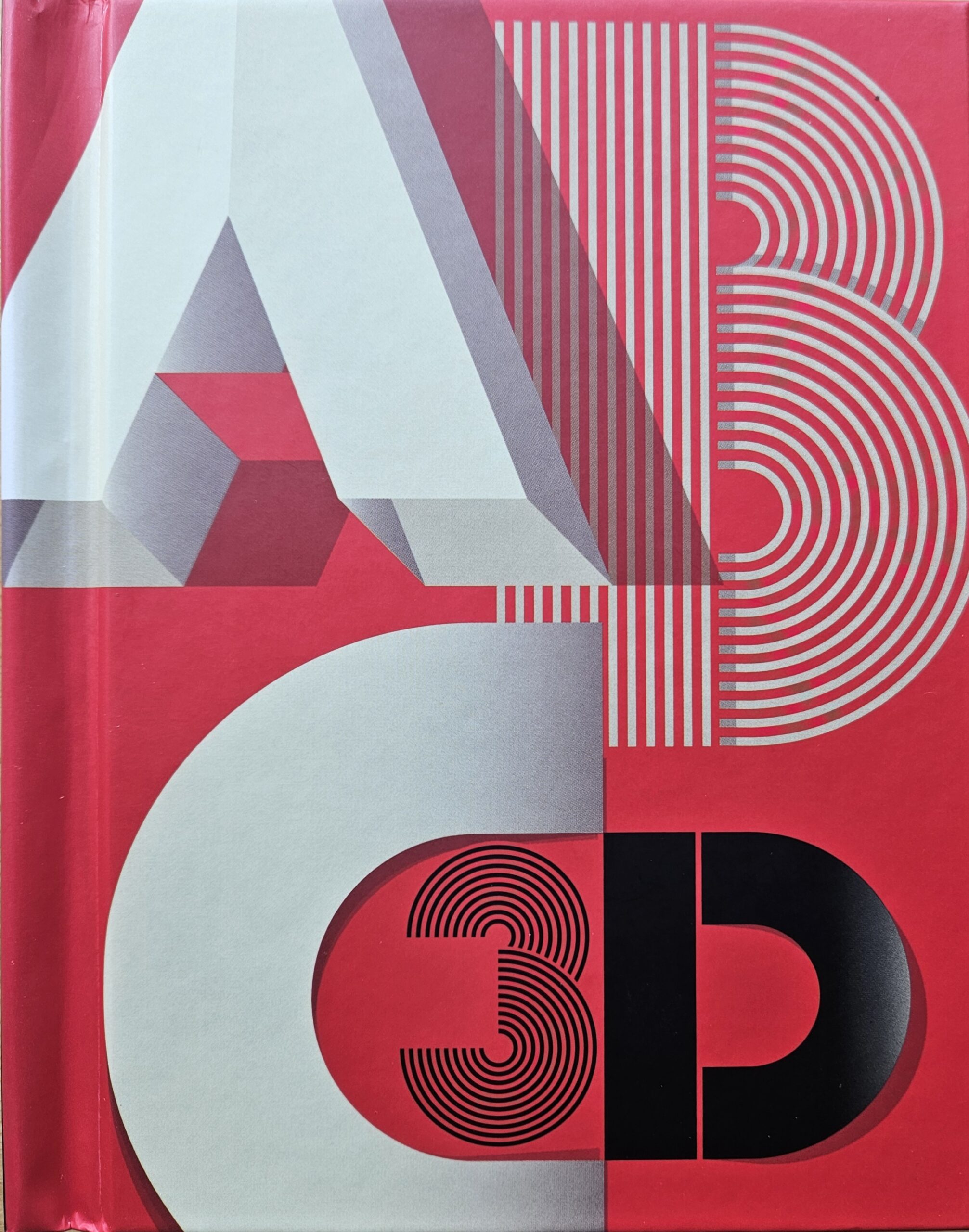
Bataille’s hybrid arsenal—wheels, mirrors, sliders, volvelles, pop-ups—in a compact brick fuses graphic design with engineering, elevating alphabets to architectural sculptures that spin and reflect, pioneering “op-up” (optical pop-up) as standalone art object and influencing minimalist interactives by decoupling mechanics from story for pure formal exploration, paving way for Boisrobert/Rigaud’s organics.
ABC 3D is Marion Bataille‘s legendary breakthrough masterpiece that redefined the modern pop-up genre. Released globally to massive critical acclaim, it set the structural and stylistic blueprint for her subsequent books like 10, Numero, and Jim.
10
Released in September 2010 (Europe) and August 2011 (United States). Published by Albin Michel (France), Corraini Edizioni (Italy), Tate Publishing (United Kingdom), and Roaring Brook Press (United States).
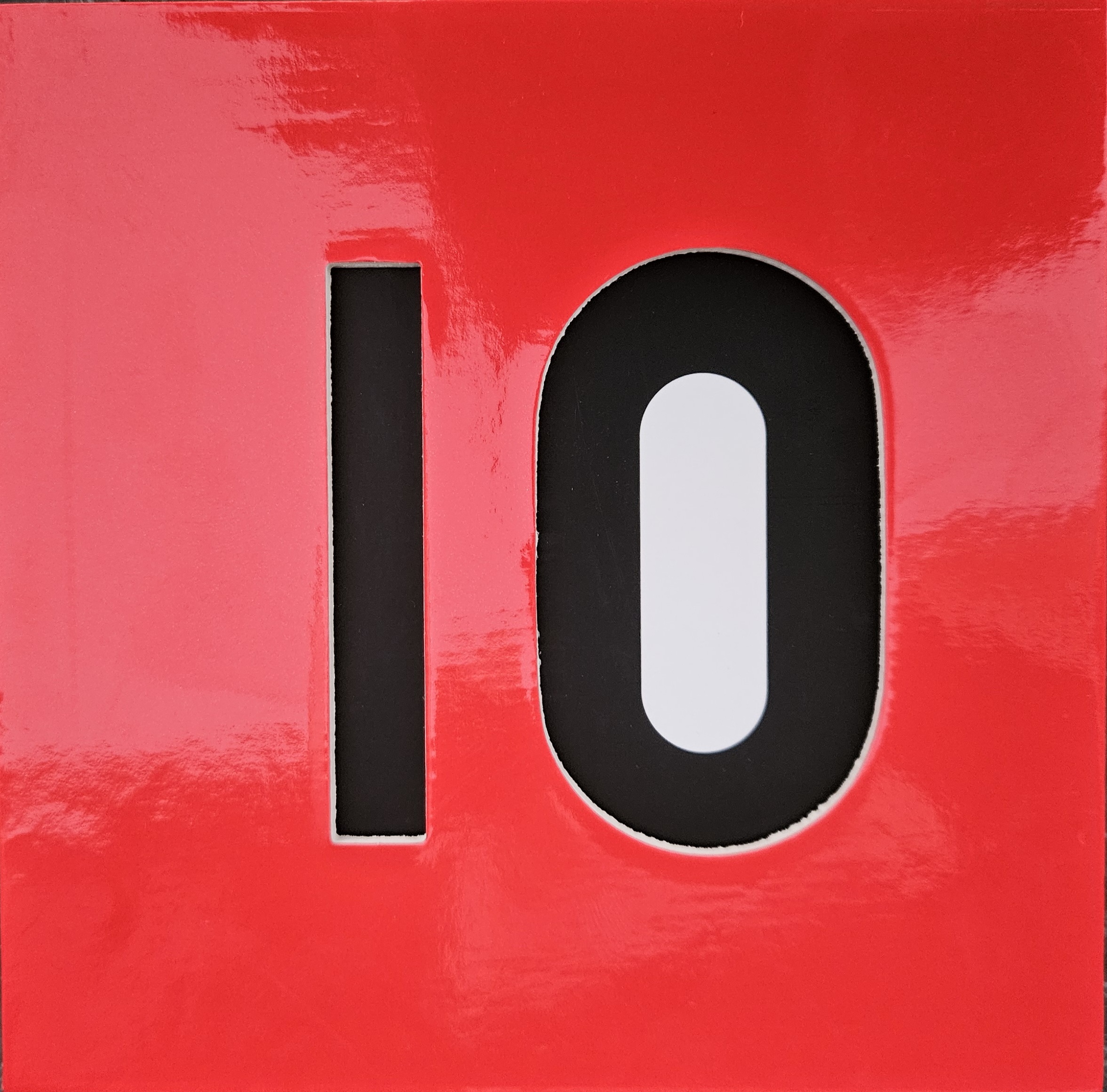
This book offers a hypnotic, geometric spectacle that reimagines counting as an elegant, fluid performance.
The design centers on kinetic metamorphosis. Turning each page causes a number to physically evolve into the next sequence forward, while simultaneously generating the descending sequence backward on the reverse side. This clever mechanism emphasizes a dual-viewing experience driven by motion.
It strips the concept of numbers down to essential geometry. Free from any decorative illustration or text, it relies strictly on minimalist primary shapes, negative space, and a bold, high-contrast palette—frequently featuring red and black.
Numero
Released in October 2013. Published by Albin Michel (France) and Chronicle Books (United States/English edition).
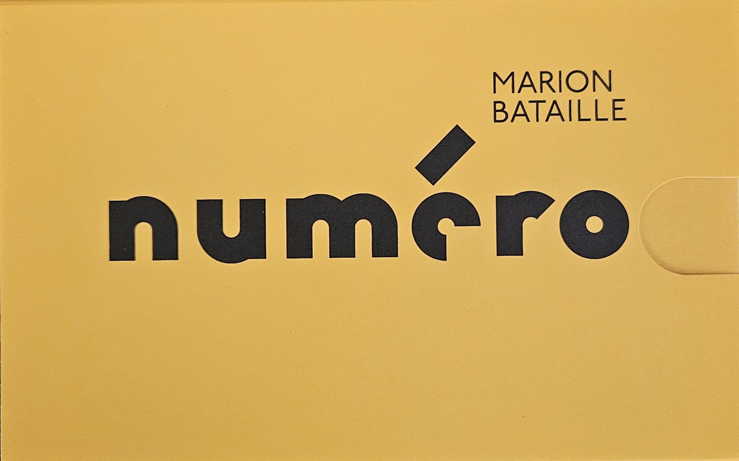 This project acts as an architectural, bright design piece that functions equally as an educational toy and a collector’s item.
It investigates how complex structural forms arise from elementary building blocks. The engineering dissects arithmetic by showing how every digit can be constructed using only two universal shapes: a straight line and a circle.
This work embraces extreme minimalism by adhering to a strict, self-imposed stylistic rule constraint (lines and circles only). Executed on heavy cardstock with a stark, luminous yellow color scheme, it rejects ornamentation in favor of pure graphic layout.
Jim
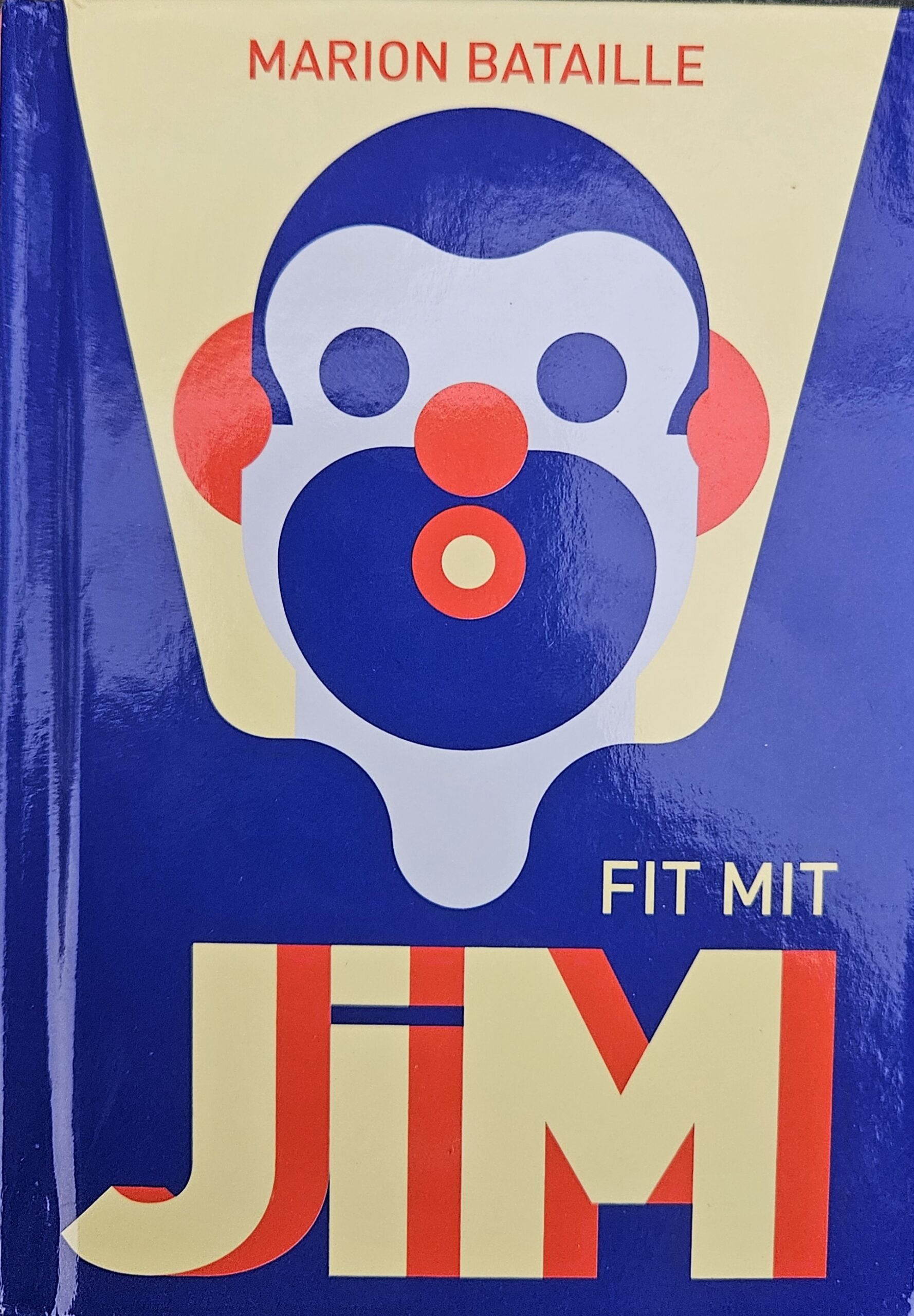 This work radiates athletic energy, rhythmic vitality, and lighthearted humor while celebrating physical activity.
It translates intricate bodily movement into highly refined, basic paper lines. Rather than drawing detailed anatomy, it uses strategic paper folds and abstract, moving shapes to capture complex poses, proving that minimal design can evoke high-energy life. This book actually reminds me most of Anouck Boisrobert‘s and Louis Rigaud‘s “The Acrobats”, from 2019, probably because of its style, which I’ll discuss a bit further down.
- From Variegated to Systemic Engineering: In ABC 3D, Bataille used a wide toolbox of tricks—including hidden pull-strings, mirrors, and transparent sheets—to make each letter unique. In her later books like Numero and 10, she traded this variety for uniform, stricter design rules (such as Numero’s law of using only a line and a circle) to see how far a single concept could stretch.
- From Language to Kinetics: ABC 3D and 10 are intensely focused on graphic design, symbols, and communication frameworks (letters and numbers). Her latest book, Jim, breaks away from text and language entirely, applying her trademark minimalist engineering directly to organic human movement and physical physics.
Influence in interactive and pop up world:
Anouck Boisrobert/Louis Rigaud
French duo Anouck Boisrobert and Louis Rigaud have created several acclaimed pop‑up picture books that combine bold, contemporary illustration with elegant, geometric paper engineering. Their books often:
- Use limited color palettes and clean shapes to let the mechanisms breathe.
- Play with perspective and repetition—forests appearing and disappearing, cities rising and shrinking—as pages turn.
- Embed themes of ecology, urban life or perception into the very act of unfolding the scenes.
- Boisrobert’s visual style, with its flat areas of color and simplified figures, pairs beautifully with collapsible structures, making each opening feel like the gentle rising of a paper sculpture rather than a surprise jack‑in‑the‑box.
Popville
“Popville”, by Anouck Boisrobert and Louis Rigaud with text by Joy Sorman, was first published in 2009-2010 by Jacoby & Stuart (German) and Roaring Brook Press (English, ISBN 9781596435933, hardcover, 14-32 pages).
This wordless pop-up book traces a village’s transformation into a vibrant metropolis through sequential spreads: starting with a lone house amid trees, cranes and buildings emerge page by page until a dense skyline with traffic and crowds fills the scene, pondering urban growth’s wonder and cost. Its minimalist value excels in silent, geometric forms—crisp colors, no text beyond subtle prompts—using pure architecture and motion to evoke expansion’s rhythm, freeing young minds to interpret change without verbal guidance.
EXAMPLES from:
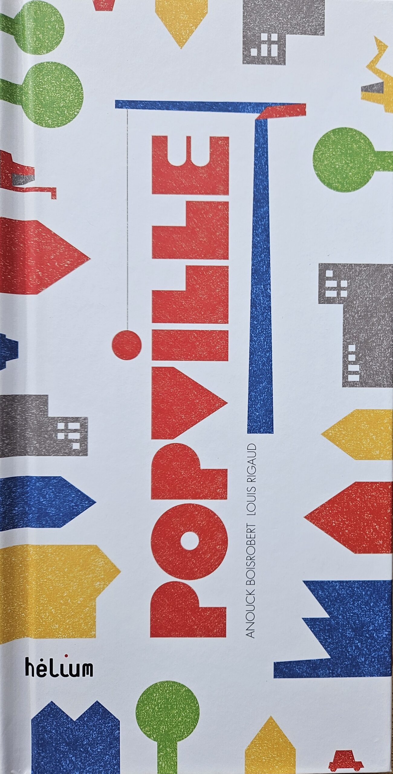
Boisrobert and Rigaud’s pioneering central window mechanism keeps rising structures elevated across turns, layering laser-cut scenes without glue for seamless vertical growth, revolutionizing pop-ups from static reveals to continuous, evolving panoramas in compact 22.5×22.5 cm format. This self-supporting evolution influenced sculptural storytelling, bridging their later acrobats and hat chases by mastering skyline density with few folds, advancing minimalist engineering for immersive, non-linear urban narratives.
AND
In the Forest / Wake up Sloth
“In the Forest” (also known as “Wake Up Sloth!” or French “Dans la forêt du paresseux”), by Anouck Boisrobert and Louis Rigaud, was published in 2011-2012 by Tate Publishing in London (ISBN 9781849760713, hardcover, 8-12 pages) with German editions via Jacoby & Stuart around 2012.
This poignant pop-up book depicts a lush rainforest’s destruction by bulldozers—trees toppling as a hidden sloth sleeps through the chaos—followed by regrowth with new saplings, urging environmental awareness through a silent cycle of loss and renewal, with readers spotting the sloth amid unfolding layers. Its minimalist value lies in evocative sparsity: bold greens and yellows on white, minimal text like “CLANG!”, and unadorned mechanics that let deforestation’s stark drama emerge purely from paper’s transformation, amplifying ecological messages without didactic excess.
EXAMPLES from:
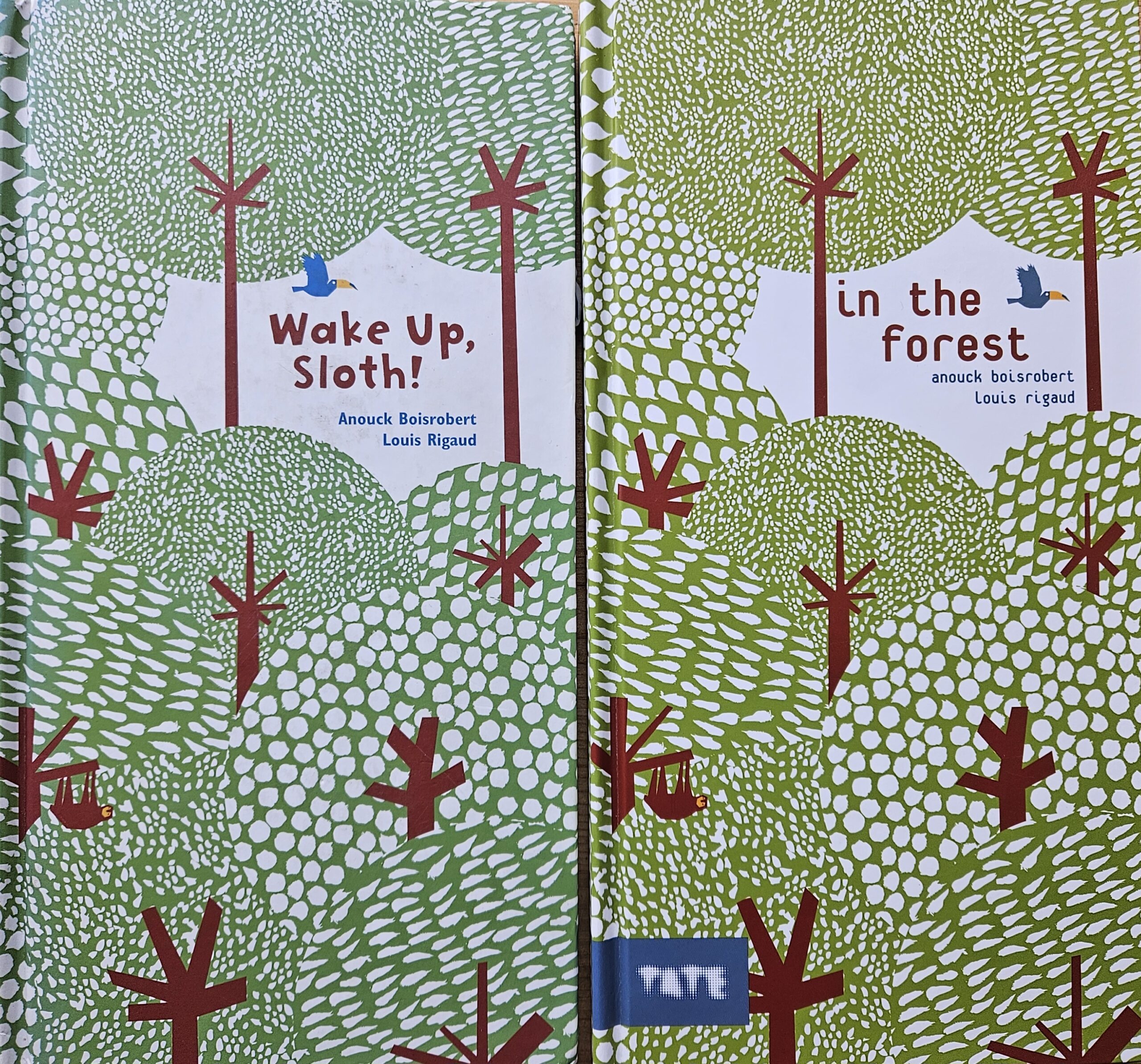
The duo’s tightly glued, die-cut spreads erect towering trees that collapse dramatically then regrow vertically (29.5×15.5 cm tall format), innovating sequential destruction-rebirth in self-supporting paper to mimic real ecological processes, evolving pop-ups from whimsy to urgent activism as in their cityscapes. This structural minimalism—few elements yielding profound change—influenced eco-focused interactive design, proving engineered folds can convey time’s passage and nature’s resilience with elegant precision.
The technique using a central window mechanism, used in popville, where the window grows larger, is here turned around and the window keeps shrinking until it disappears completely.
AND
Under the Ocean
“Under the Ocean” (or original French “Oceáno”), by Anouck Boisrobert and Louis Rigaud, was published in 2013 by Tate Publishing (ISBN 9781849761598, hardcover, 10 pages) following its French debut by Helium/Actes Sud.
This vertical pop-up voyage follows the red sailboat Oceáno from polluted ports through Arctic ice, storms, and sunsets to a pristine lagoon, with engineered layers piercing the “water surface” to reveal teeming marine life—fish, whales, coral—contrasting surface bustle against underwater splendor and subtle pollution threats. Its minimalist value thrives in wordless precision: stark blues/greens on white, sparse onomatopoeia like wave crashes, and pure paper mechanics crossing the sea’s horizon, distilling oceanic awe to essential contrasts without narrative overload.
EXAMPLES from:
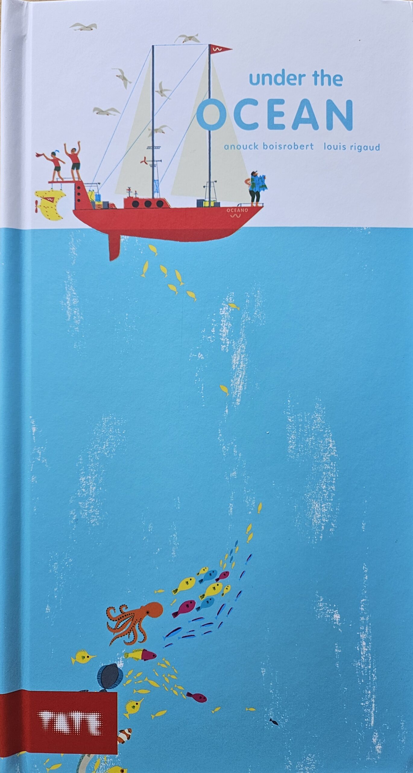
Matching “In the Forest’s” tall 29.5×15.5 cm format, Boisrobert and Rigaud innovate a pierced “horizon line” where elements protrude above/below—icebergs calving, whales breaching—for dual-world immersion via glue-free laser cuts, evolving pop-ups into cross-sectional ecosystems that build on sloth’s collapse-rebirth with fluid, multi-depth motion. This minimalist layering mastery advanced interactive nature books, enabling compact verticality to evoke vast abysses, influencing subsequent works’ environmental choreography with fewer, horizon-pivoting folds.
The technique using a piece of paper popping up as a division between the above and under water worlds, was seen before in a pop up created by Matthew Reinhart in his Book of Nightmares, in the drowning pop up spread. See episode 6 of this blogpost series:
AND
That’s my Hat!
“That’s My Hat!” or original French “C’est mon chapeau!”, by Anouck Boisrobert and Louis Rigaud, was published in 2016 by Jacoby & Stuart Verlag in Berlin (ISBN 9783942787703, hardcover, 28 pages).
This interactive pop-up book sparks a whimsical chase through a bustling pop-up city after a little mouse loses its cherished hat to the wind, passing dogs, birds, cars, and crowds before a surprising reunion, emphasizing themes of loss, pursuit, and simple joys of urban discovery. Its minimalist value radiates through elegant restraint: clean lines, vivid primary colors on white paper, and zero text, letting kinetic pop-ups propel the wordless story and ignite viewer imagination unburdened by narrative excess.
EXAMPLES from:
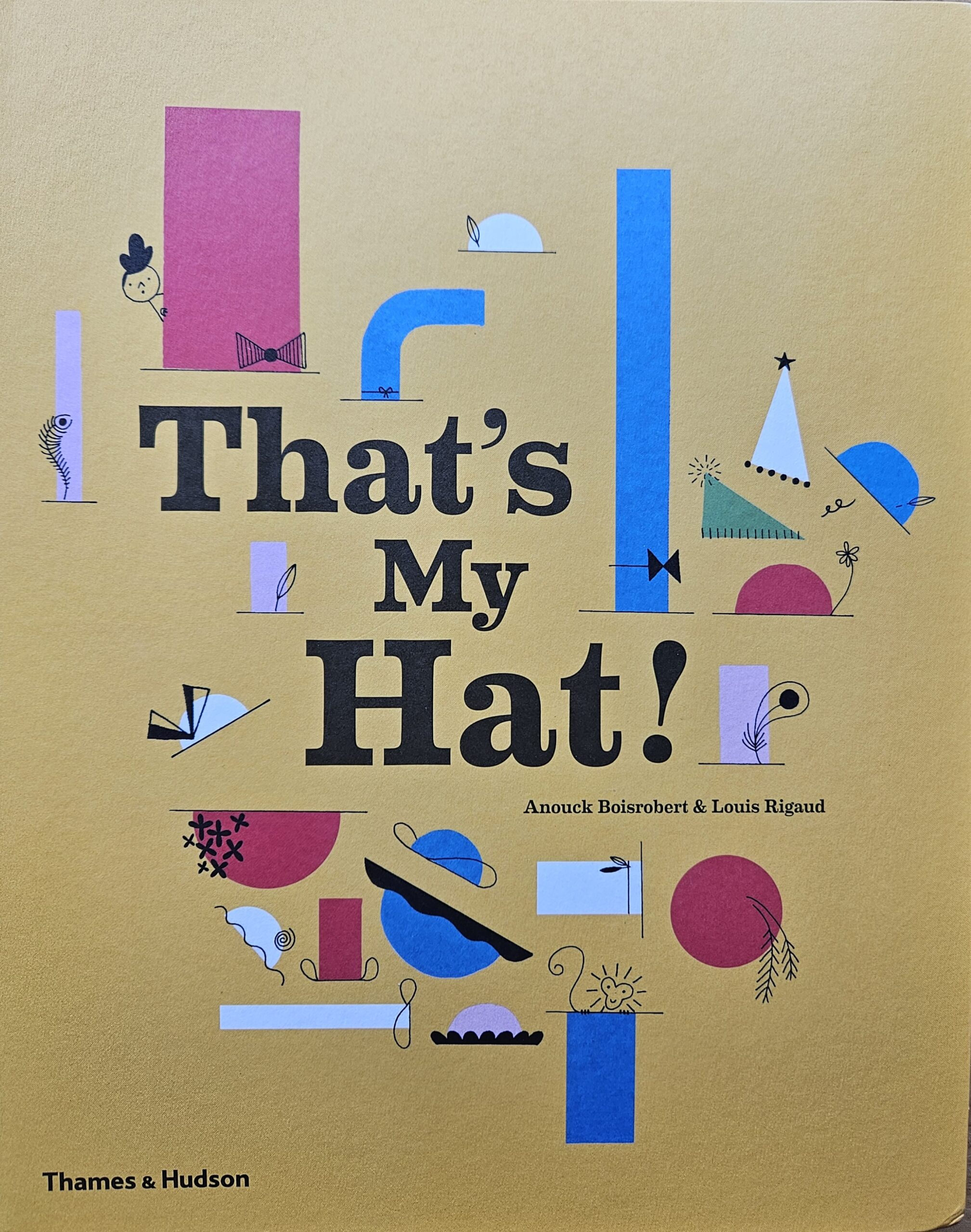
Boisrobert and Rigaud employ their hallmark laser-cut, glue-free engineering for multilayered cityscapes that burst open sequentially—tiny mouse darting past skyscrapers and traffic—pushing pop-up boundaries with precise folds mimicking fluid motion and depth in tight 15×28 cm spreads. This evolves the medium by distilling complex environments into self-assembling layers, prioritizing seamless interactivity over bulk, much like their acrobats’ balance feats. The hat’s fluttering path showcases advanced paper choreography, influencing minimalist pop-up design toward atmospheric immersion with fewer, smarter elements.
AND
Famille Acrobate
“Eins, zwei, drei, die Akrobaten!” (German edition of “Famille Acrobate” or “1,2,3, Acrobats”), created by Anouck Boisrobert and Louis Rigaud, was published in 2019 by Die Gestalten Verlag in Berlin (ISBN 9783899558340, hardcover, 18 pages).
This interactive pop-up book follows a family of acrobats stacking into increasingly tall human pyramids under a circus tent—from one performer to ten, topped unexpectedly by their cat Mistinguette—before a playful collapse, teaching counting through joyful physical feats and teamwork. Its minimalist value shines in sparse text, bold cut-paper colors, and reliance on pure mechanics for narrative drive, distilling circus wonder to essential forms without clutter.
EXAMPLES from:
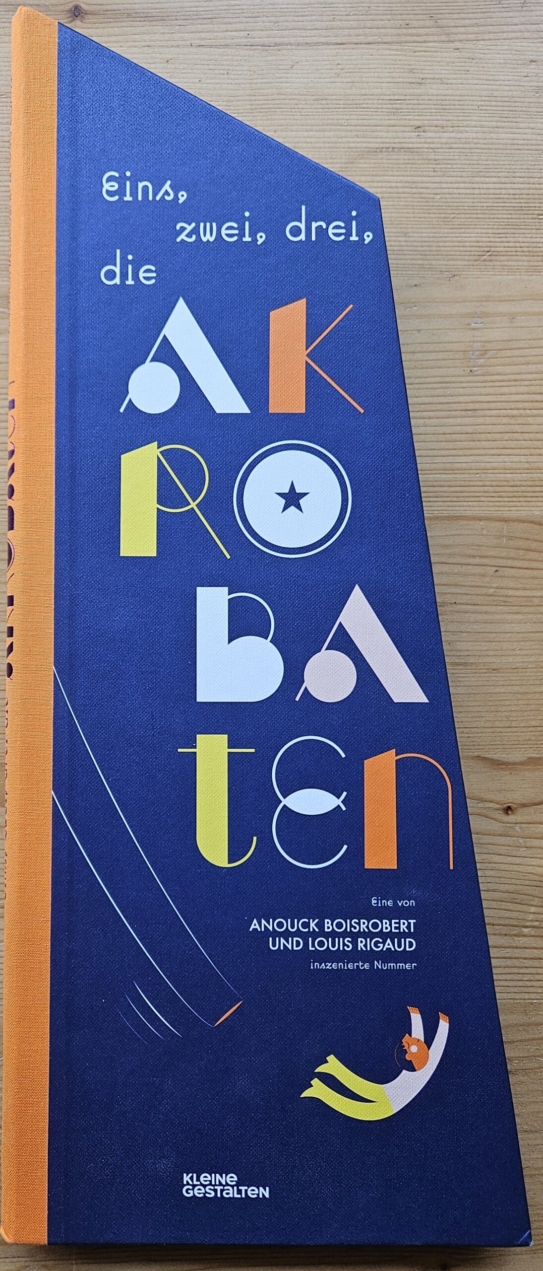
Boisrobert and Rigaud’s signature laser-cut, tabless pop-ups form freestanding 3D pyramids that sway realistically, advancing the craft by merging sculpture with storytelling and proving minimal paper engineering can evoke dynamic motion and tension. This 16 cm high triangular format maximizes vertical drama, influencing pop-up evolution toward self-supporting, gravity-mimicking designs seen in their eco-books like “In the Forest.”
The work’s elegance lies in its restraint: few elements yield maximum interactivity, embodying minimalist pop-up philosophy where less paper enables more imaginative play.
AND
Lou là-Haut
“Lou là-haut” (English “Lou, Up There”), by Anouck Boisrobert and Louis Rigaud, was published in 2021 by Hélium (Actes Sud, ISBN 9782330155018, hardcover, 14 pages, 17.5 x 31 cm).
Lou, a young hiker obsessed with spotting a wolf, embarks on a multi-day mountain expedition, journaling her sensory encounters with alpine wildlife, weather, and vast panoramas while searching rocky ridges and glaciers, culminating in a magical, camouflaged encounter that blends awe and harmony with nature. Its minimalist value emerges in layered restraint: subtle journal entries amid vast white spaces, punchy colors evoking dawn-to-dusk shifts, and text-free “seek-and-find” wolf hunts that prioritize immersive observation over exposition, distilling wilderness wonder to paper’s quiet poetry.
EXAMPLES from:
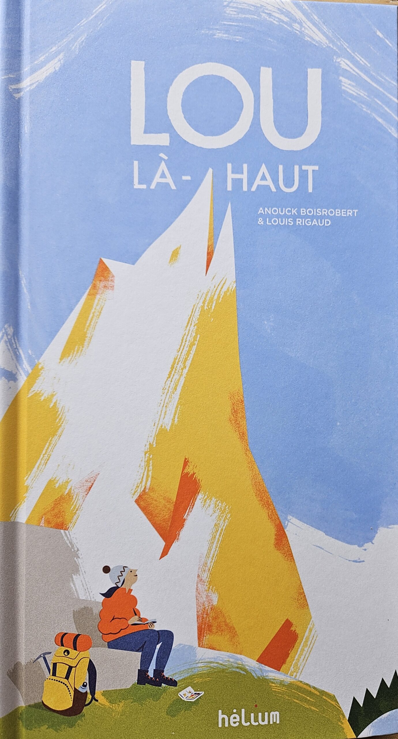
Horizontal spreads deploy parallel paper planes forming vertiginous valleys, sheer cliffs, and peaks (up to 30 cm deep), evolving the duo’s vertical slicing from ocean/forest into panoramic depth fields via laser-cut, tabless strata that shift with page turns, mimicking hike progression and animal camouflage. This refines minimalist pop-up geography—sparse silhouettes yielding infinite scale—influencing landscape interactives by proving broad formats can evoke altitude’s disorientation with economical, self-aligning layers building on prior urban/eco mechanics.
This is characteristic minimalist pop‑up design: mechanisms like simple V‑fold hills, slender parallel folds and restrained box forms support a calm, almost meditative graphic language instead of shouting for attention as we saw in the exuberant works of Sabuda and Reinhart.
The little Prince
The same minimalist logic appears in certain pop‑up editions of “The Little Prince,” where empty space, a single planet, or a lone tree popping gently from the page feels more important than sheer mechanical complexity.
“The Little Prince” (Pop-Up), adapted from Antoine de Saint-Exupéry’s 1943 classic with paper engineering by Pop-up Studio Joost, was published in 2015-2020 by Gallimard Jeunesse (ISBN 9782070667222, hardcover, 66 pages).
A pilot crashes in the Sahara and meets the Little Prince, who shares his interstellar journey tending a vain rose, taming a fox, encountering vain adults on asteroids, and learning on Earth that “one sees clearly only with the heart,” as stars laugh with his absent laughter—urging childlike wonder amid grown-up folly.
Its minimalist value rests in restrained mechanics elevating Saint-Exupéry’s sparse line art: subtle pull-tabs and wheels activate iconic scenes like the meeting with the snake or fox taming without overwhelming the text’s poetic economy, distilling fable’s essence to elegant, uncluttered reveals.
EXAMPLE from:
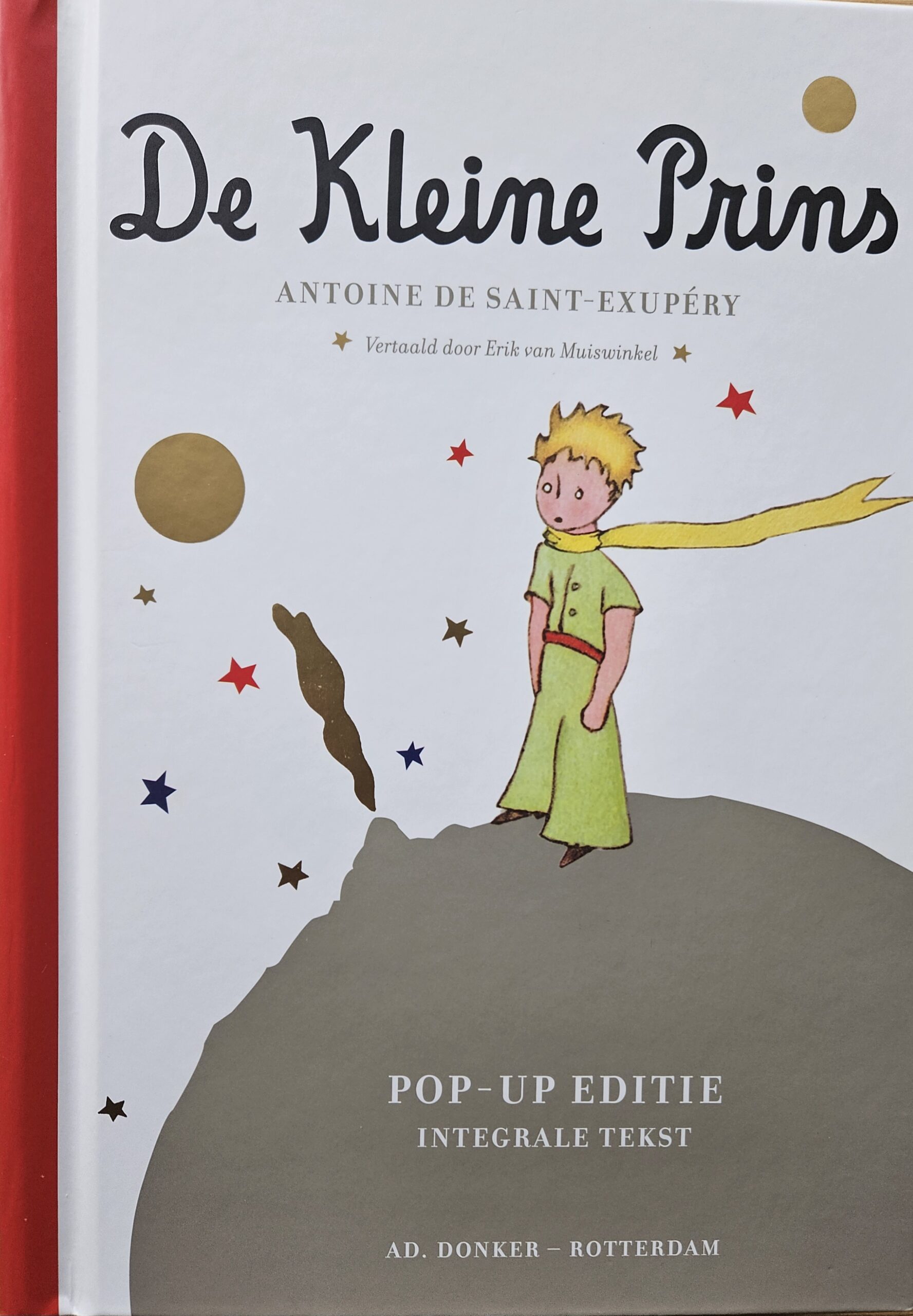
This deluxe edition animates nearly every original drawing via intricate pull-tabs, rotating planets, and layered asteroids in a thick 66-page format, reviving classic adaptation by embedding motion directly into Saint-Exupéry’s minimalist sketches—proving pop-ups can enhance literary icons without redesign, influencing licensed interactives through precise, text-integrated engineering that balances reverence with play.
Unlike Boisrobert/Rigaud’s glue-free organics, it favors traditional glued levers for narrative fidelity, advancing pop-up evolution in fidelity to source art over pure abstraction.
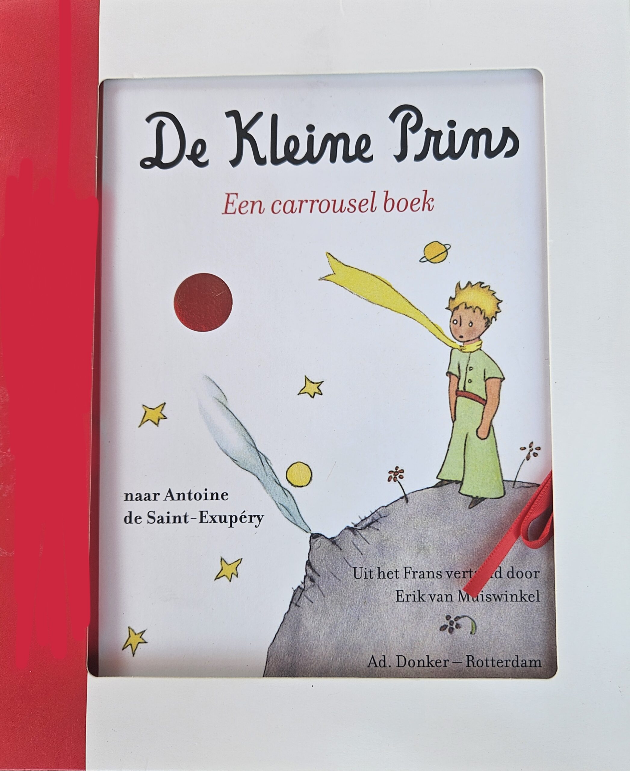
And then there was this beautiful carrousel version, reminiscent of the 19th and 20th century carrousel books, which can hang from a ceiling or stand its ground on a coffee table…
Conclusions
We’ve journeyed from ancient volvelles, via the first pioneers of pop up like Lothar Meggendorfer, past WWII via Kubasta and Pienckowski into the modern age with Van der Meer, Sabuda and Reinhart, into minimalism through Bataille’s kinetic ABC3D to Boisrobert and Rigaud’s minimalist marvels—Eins, zwei, drei, die Akrobaten!, Popville, Lou là-haut—witnessing pop-ups evolve from tools for science and pseudo science into playful displays for children and finally into sculptural storytelling that balances whimsy, ecology, and engineering precision.
This 9-part saga (intro plus 8 deep dives) closes the Booknook Librarian’s History of interactive books. Thank you dear readers, for exploring with me at www.wandelgek.nl—may these paper wonders keep unfolding in your hands. And keep reading books, there’s often more to them than that what meets the eye !!!